

E-CAMP
Design for Remote Learning
Meet the needs of different students in online courses
UX/UI
Data Analysis
Mobile APP
Group Work
Set-Up
Problems & Background
Due to the pandemic of COVID-19, many Colleges / Universities started full-time remote learning from March 2020.
There were 110 million people in the world enrolled in online courses
73% of students have concerns about whether they can be successful with online instruction.
52% of students never even look at the courseware because of the technical problem of the online teaching app.
Confused course management and a plethora of instructional software to download and use. It can stress students out and reduce their chances of successfully completing a course. This situation has to be changed.
Challenge
Conduct exploratory research to uncover new possibilities for the spatial/experiential and ethical dimensions of online learning. In order to make the interaction process between all aspects of online learning more unimpeded to provide college students a better experience of online education, and solve the problems encountered by most students.
Solutions
In response to this challenge and problem, we have developed an app - [E-Camp]. Integrate and optimize a variety of learning and communication software. And it aims to help students complete distance courses with high efficiency, high comfort, and improve their learning experience.
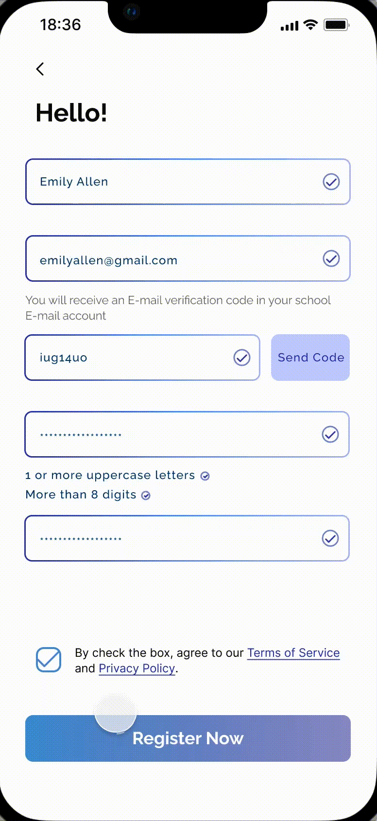
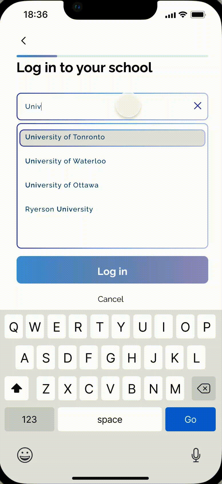

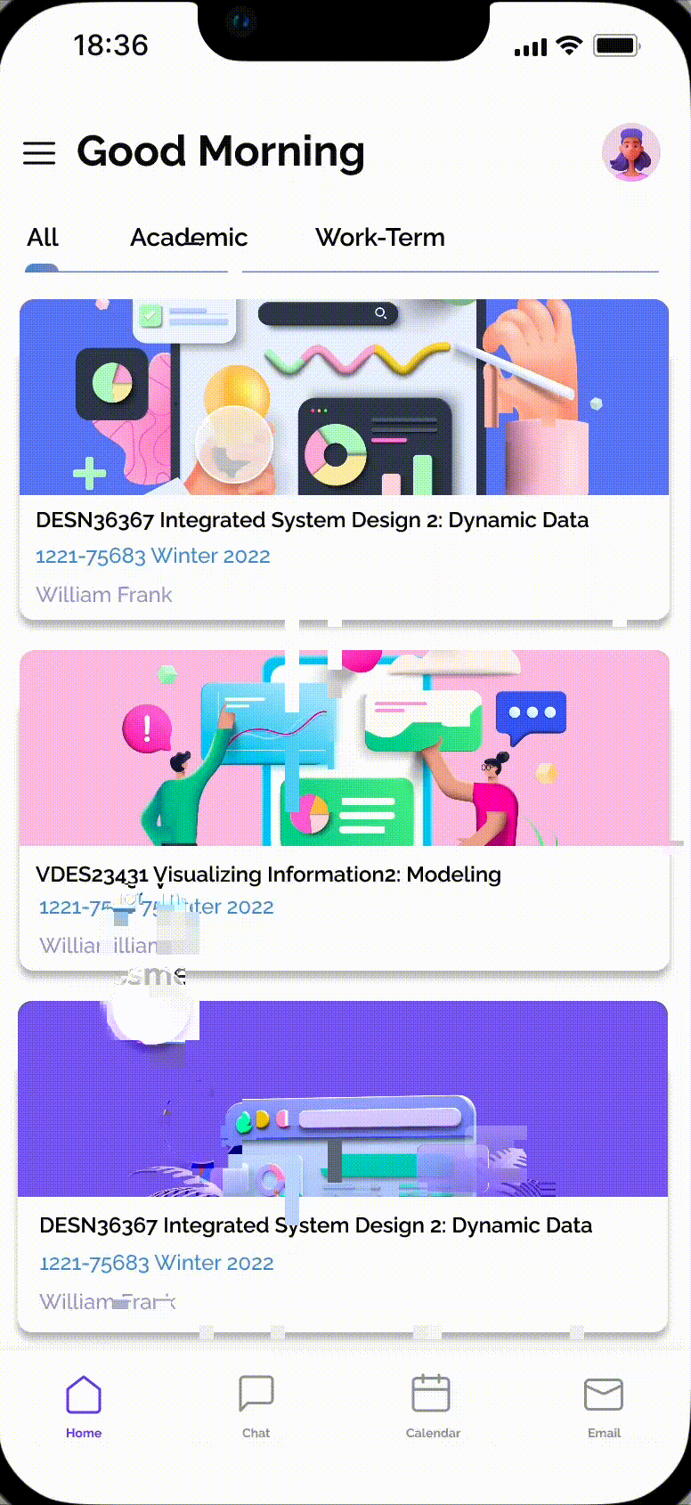
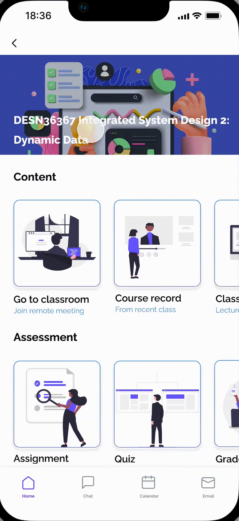
Link with all school accounts to obtain class information in real time
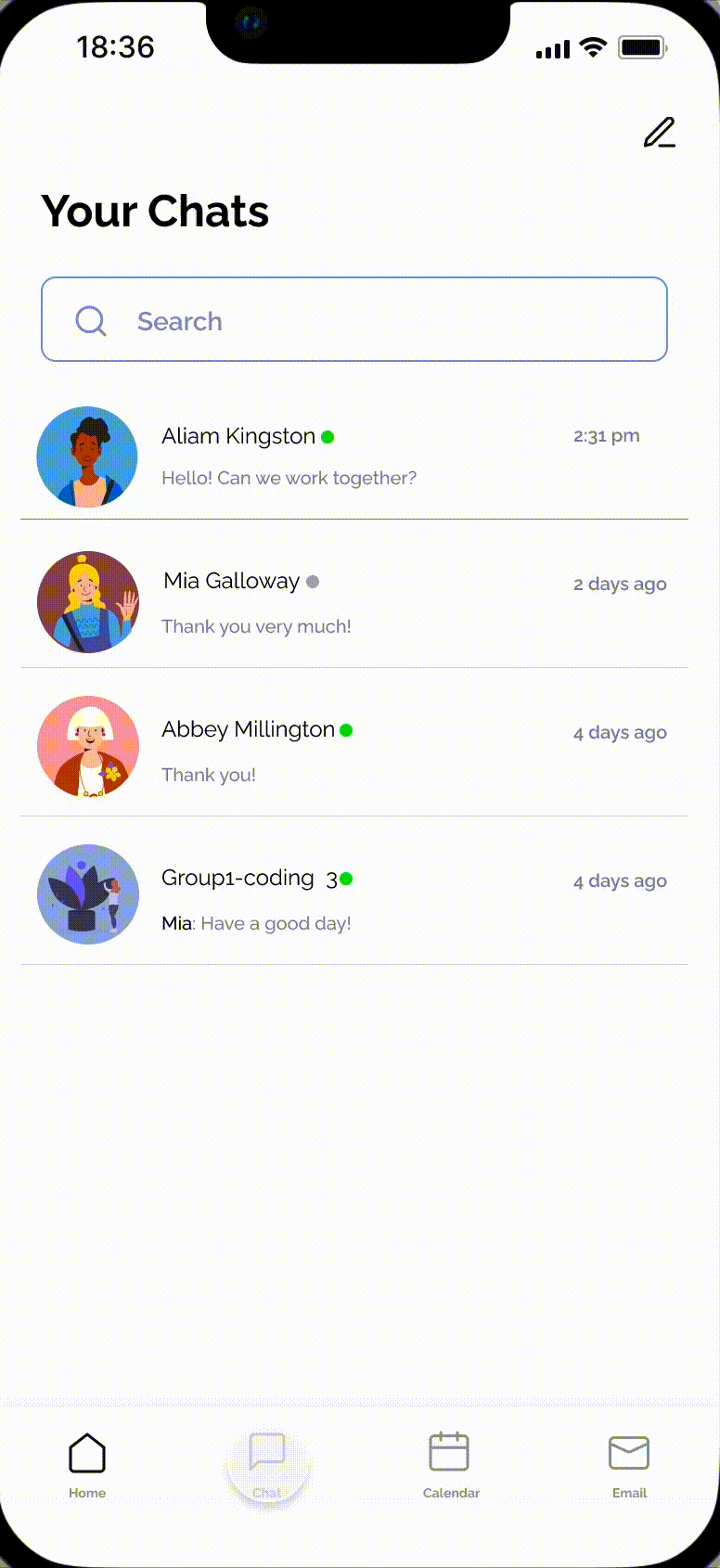
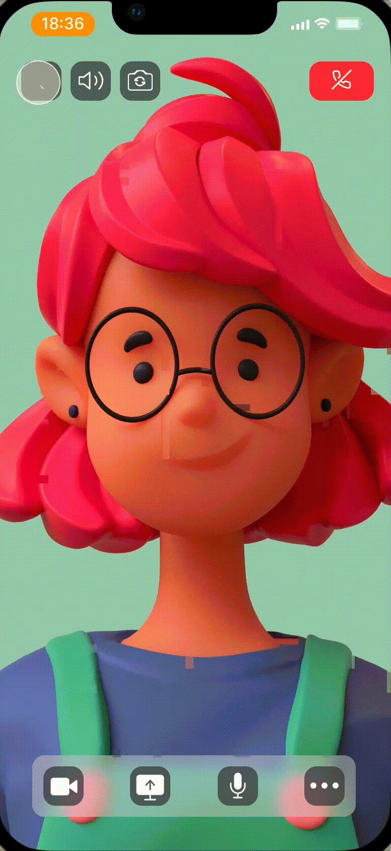
Covers most of the functions needed for learning, submitting assignments, live classes, discussion boards, and video recordings of past courses.

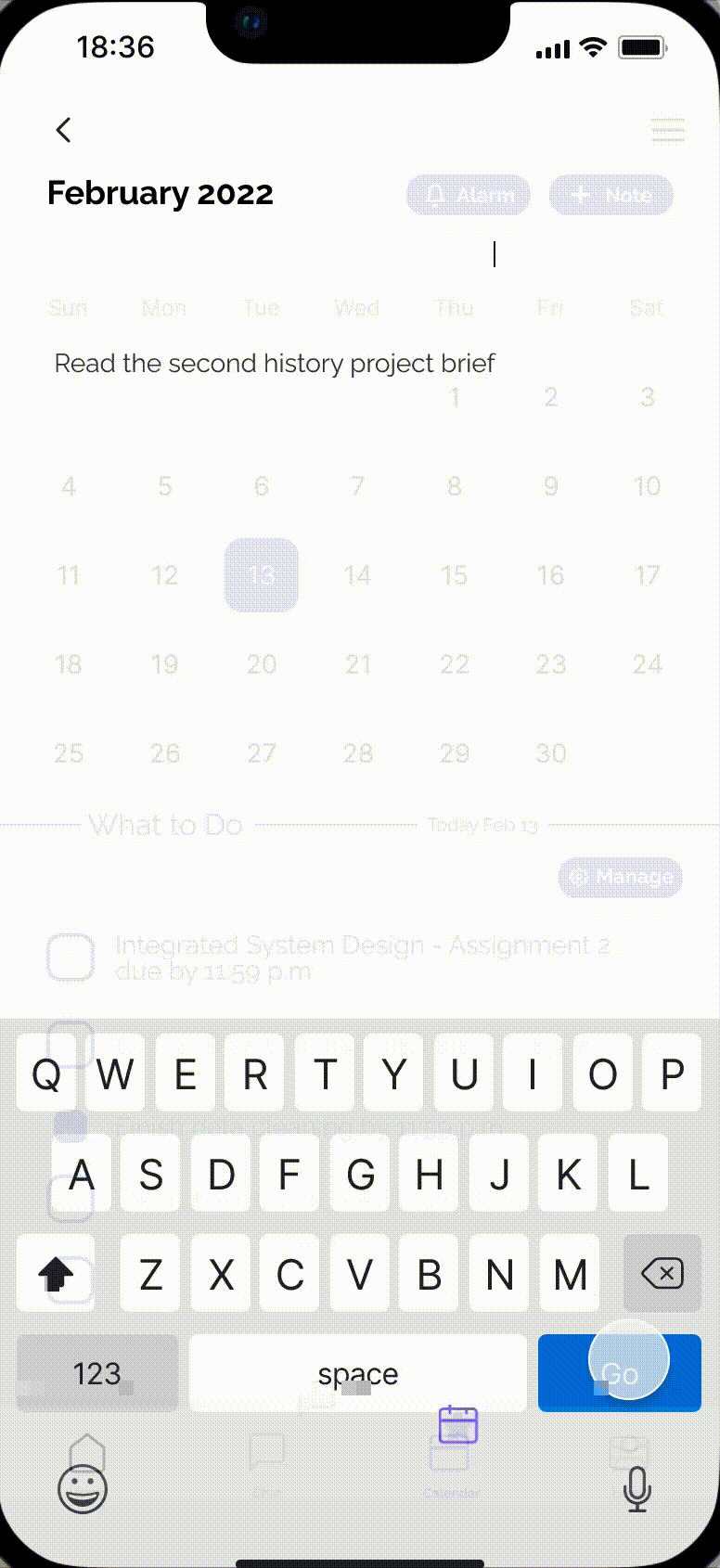
The alarm clock reminder function that can be set freely helps students remember every assignment and exam that needs to be submitted, and the mailbox associated with the school account makes students no longer miss emails.
Integrate and optimize a variety of learning and communication software so that there are no communication barriers between students and teachers.


Approach
Research
We conducted 8 user interviews that ranged from the students who are involved in remote learning which need a place to get more comprehensive and organized learning materials in another country/time zone, and the staff who work from home and need an online study to teach students.
“I don’t hate online classes, but I always feel that the distance between me and my classmates has become further. It is difficult to unify contact information every time I do group work, and I can’t find them.”
— From Third Year University Student
Sometimes I have group projects, I can’t connect my teammates successfully, because I don’t have their information, so I think schools should pay more attention to this part.
— From A First Year University Student
“Each time I had to change different software for different courses, each time I had to log in and use a different account. To make matters worse, since I am not studying in Canada, I need to dial a different VPN to log in to websites outside China.”
— From A Second Year College Student
Pain Points
After interviews, we summarize the following pain points for our users.

User Journey Map

Insights
The biggest pain point for users is too many applications and messages. Switch accounts between applications and submit jobs.
So we integrated and optimized various student functions. Use one Account.

Design
Brainstorming
According to the insights we collected from the user research, we discussed and brainstormed the features and functions which are based on the journey map for potential user requirements, and convert user needs into our design requirements. We put forward different views on the functions and design an application that can integrate all the user needs and bring to users a more convenient user experience.

Functional Requirements

Action Priority Matrix

Design requirements

System Map & User Flow


Style Tile

High Fidelity Design


Reflection
In this project, we completed the design of most of the functions according to the urgency and difficulty of user needs. Because of time constraints, we had to discard or simplify some functions. In addition, due to the impact of the epidemic during the research phase, we had to transfer the interviews and user tests that should have been conducted in person to online, so there was a long delay in these two phases.
During the completion of this project, I improved my time management ability, and I can better arrange the process and time of the entire project in future projects.
Evaluate
Usability Testing
Based on our user tests of three participants, we have come up with some suggestions for improvement.